 Give Feedback
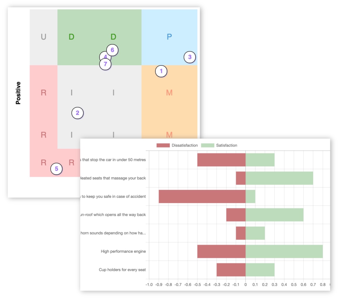
The Kano Survey Design Report ()
What 1,172 real Kano surveys reveal about getting better product prioritisation data
How do the best Kano surveys actually look? What sizes, response counts, and segmentation approaches produce the most useful results?
We analysed 1,172 real Kano surveys with tens of thousands of responses run on this platform to find out. The patterns are clear: the quality of a Kano result depends heavily on survey design. The best surveys are focused, segmented, balanced across feature types, and interpreted through signal strength rather than category labels alone.
Here are 8 practical findings for anyone running - or planning - a Kano survey.
1. Test around 6-10 features per survey
The clearest pattern in the data is that most successful surveys are not huge. The majority of surveys tested between 6 and 10 features, and the median across all 1,172 qualifying surveys was exactly 8 features.
| Features tested | Share of surveys |
|---|---|
| 4-5 | 23.7% |
| 6-10 | 63.4% |
| 11-20 | 5.7% |
| 21+ | 0.9% |
Why does 6-10 work so well? There are a few practical reasons.
First, the Kano format asks two questions per feature (how do you feel if it's present, and how do you feel if it's absent), so a 10-feature survey is already 20 questions. Beyond that, respondent fatigue sets in and answer quality drops.
Second, limiting yourself to 6-10 features forces you to be genuinely selective - it is a design discipline in itself. If you can only test 8 things, you have to prioritise what really matters before the data even comes in.
Third, a tighter feature set makes the results easier to act on: a clear ranking of 8 ideas is much more useful than a sprawling list of 25 with only marginal differences between them.
Recommendation: Aim for 6-10 features. Enough to compare trade-offs, not so many that the survey becomes exhausting to complete or the results hard to interpret.
2. More responses reveal more indifference
As response counts increased, the share of Indifferent results rose sharply - from 20% among surveys with 10-20 responses, to 56% among surveys with 200 or more.
| Survey responses | Indifferent rate |
|---|---|
| 10-20 | 20.3% |
| 21-50 | 25.0% |
| 51-100 | 45.2% |
| 101-200 | 50.5% |
| 201+ | 56.2% |
This is not a coincidence or a data quality problem - it reflects something real about who responds to surveys early. The first people to complete your survey tend to be your most engaged users: customers who already like your product, colleagues who want to help, or enthusiasts who sought out the link. They are disproportionately enthusiastic, and that inflates early results.
As you gather more responses and reach a broader, more representative audience - casual users, sceptics, people who only use one or two features - the more honest picture emerges. Many people genuinely do not care about features that seemed exciting in a small sample.
This does not mean small surveys are worthless. It means you should interpret them cautiously, especially for features that look like strong Delighters with only 15 or 20 responses behind them.
Recommendation: Use larger response counts to pressure-test enthusiasm. Aim for at least 50 responses before drawing firm conclusions, and treat anything under 20 as directional only.
3. Segment your results - the average can mislead you
A Kano survey gives you an overall result for each feature, but that overall result is an average across all your respondents. If your audience is not homogeneous - and most audiences are not - that average can hide very different opinions underneath it.
KanoSurveys lets you add custom questions to your survey: things like "What is your role?", "How long have you been a customer?", or "Which plan are you on?". Once responses come in, you can filter and compare results by each of those answers.
A feature might look like a weak Performance feature overall, but when you break it down by role, enterprise users might score it a Must-have while individual users are completely Indifferent to it. Those are very different signals - and they point to very different product decisions.
The data shows just how significant this effect is. Across surveys where segment data was available, category disagreement between groups was very high:
| Segment dimension | Disagreement rate between groups |
|---|---|
| Industry | 87.5% |
| Occupation / profession | 87.5% |
| Experience level | 87.5% |
| Time since last relevant event | 78.1% |
| Usage frequency | 75.0% |
In practical terms, an 87.5% disagreement rate means that in nearly 9 out of 10 features tested, at least two groups within the survey gave that feature a different Kano category.
Consider a concrete example: a survey testing "advanced reporting features" might show an overall result of Performance. But when split by role, data analysts rate it a Must-have while marketing managers rate it Indifferent. Building - or not building - that feature based purely on the overall average would give the wrong answer for both groups.
Recommendation: Add at least one or two useful segmentation questions - customer type, role, plan tier, usage frequency, or experience level. Collecting only names and emails does not explain why users value features differently.
4. Treat weak consensus as a signal to investigate, not a final answer
A Kano result is not just a category label - it also has a strength behind it. When 70% of respondents agree that a feature is a Delighter, that is a very different result from when only 32% agree. Both technically produce the same dominant category, but the confidence behind them is worlds apart.
Across the dataset, truly decisive results were rare. Only 13.8% of features had strong or very strong consensus.
| Signal strength | Agreement threshold | Share of features |
|---|---|---|
| Weak | 25-40% | 30.6% |
| Moderate | 40-60% | 55.2% |
| Strong | 60-80% | 12.1% |
| Very strong | >80% | 1.7% |
KanoSurveys shows statistical significance levels directly on your results, so you do not have to calculate this yourself. Features are flagged as low, moderate, or high confidence based on response count and the spread of answers. A feature flagged as low confidence is telling you to gather more data before acting on it - not to ignore the result, but to treat it as a hypothesis rather than a conclusion.
Recommendation: Do not blindly accept the dominant category. A Delighter with weak agreement is very different from a Delighter with strong agreement. Check the confidence level shown on your results before making roadmap decisions.
5. Use Kano to find waste, not just winners
In product development, "waste" means building something that does not deliver value - features that consume engineering time, design effort, and maintenance overhead, but that customers do not actually want or use. It is one of the most expensive and common problems in product teams, and it often happens because the internal team was enthusiastic about an idea that turned out not to resonate with real users.
Kano surveys are one of the best tools available for identifying waste before you build. Across the dataset, 24.5% of tested features were Indifferent or Reverse - meaning roughly one in four ideas that product teams thought were worth testing turned out to be things users either did not care about or actively disliked.
Including features with a weak signal - where even the dominant category had less than 30% agreement - the potential waste pool rises to 27.6%. That is over a quarter of the roadmap ideas being tested.
Recommendation: Frame Kano surveys as a way to remove ideas from the roadmap, not just rank the exciting ones. A good Kano survey should answer:
- What should we build?
- What should we delay?
- What should we stop talking about?
- What looks exciting internally but users do not care about?
6. Include a mix of feature types - especially AI
Different feature types produce very different Kano patterns, and understanding those patterns before you survey can help you design a more balanced and informative test. AI and UI features lean heavily towards Delighter, while Admin and Export features skew towards Must-have.
Highest Delighter rates
| Feature type | Delighter rate |
|---|---|
| AI | 66.0% |
| UI / Custom | 64.8% |
| Integration | 63.8% |
| Mobile | 62.3% |
Highest Must-have rates
| Feature type | Must-have rate |
|---|---|
| Admin / Security | 14.1% |
| Export / Import | 10.0% |
| Notification | 7.0% |
| Search / Filter | 6.4% |
The AI picture is particularly striking. Not only does AI produce the highest Delighter rate of any category, but the volume of AI features being tested has exploded - from 39 AI features tested across all surveys in 2022, to 230 in 2025 alone. AI is everywhere in product roadmaps right now. And the data shows that users really do respond to it: looking at the year-by-year trend, the Delighter rate for AI features climbed from 44% in 2022 to 78% in 2024.
| Year | AI features tested | Delighter rate | Must-have rate | Indifferent rate |
|---|---|---|---|---|
| 2022 | 39 | 44% | 5% | 13% |
| 2023 | 20 | 60% | 10% | 20% |
| 2024 | 37 | 78% | 3% | 8% |
| 2025 | 230 | 69% | 1% | 17% |
The hype around AI is backed by real user data - users genuinely respond positively to AI features. However, there is a pattern worth watching. As AI becomes ubiquitous in products, user expectations are rising. The Kano drift effect suggests that features which are Delighters today tend to become Must-haves over time as they become standard. Teams surveying AI features now are doing so at peak excitement, and results should be interpreted with that in mind - what delights today may be expected tomorrow.
Recommendation: Do not only test exciting growth features. A balanced survey might include:
- 2-3 potential Delighters (AI, UI, integrations)
- 2-3 Performance features
- 1-2 possible Must-haves (admin, security, exports)
- 1-2 risky or controversial ideas
7. Test outlandish ideas - Reverse results are rare but powerful
Reverse features were rare overall at just 1.1% of all tested features. But that rarity is part of what makes them so valuable when they do appear.
It is worth testing ideas that might seem extreme or controversial, even ones you are not sure you would actually build. The Kano format is not just for validating good ideas - it is for understanding the shape of customer opinion. A feature that turns out to be Reverse is not a failed test; it is a piece of genuine insight that tells you something important about what your users value and where their tolerances are. Some of the most useful things a product team can learn are the ideas that customers would actively dislike.
Looking at the real-world examples in the data, the features with the highest Reverse percentages included:
| Feature | Reverse responses |
|---|---|
| Mandatory app usage | 53.5% |
| Cameras on (required) | 46.7% |
| Gamified challenge mechanics | 43.3% |
| Cashback / loyalty points schemes | 34.7-39.1% |
These are all ideas that teams were genuinely considering - gamification, loyalty programmes, attendance requirements. Without the data, it would be easy to assume these were reasonable ideas. The Reverse signal is a clear warning: users are not just indifferent, they would be put off by these features.
Recommendation: Include at least one or two bold or unconventional ideas in your survey. If they come back as Reverse, you have saved yourself the effort of building them. If they come back as Delighters, you have found something genuinely exciting. When you do see a Reverse result, pay close attention - it often points to loss of control, forced behaviour, privacy concerns, or friction that outweighs the apparent benefit.
8. Separate growth drivers from retention risks
The Kano category tells you what a feature is. But the satisfaction and dissatisfaction coefficients - shown in the advanced Kano analysis on KanoSurveys - tell you how much it matters in each direction.
The two coefficients work like this:
- Satisfaction coefficient (CS): how much does this feature increase satisfaction when it is present? Range 0-1; higher is better.
- Dissatisfaction coefficient (CD): how much does this feature cause dissatisfaction when it is absent? Range -1-0; closer to -1 means more pain.
The asymmetry is the difference between the two: CS minus the absolute value of CD.
A high positive asymmetry means the feature creates more joy when present than pain when absent - a growth driver you build to stand out.
A low or negative asymmetry means the reverse: users barely notice when it is there, but are upset when it is not - a table-stakes feature you need to protect.
High asymmetry - growth drivers
| Feature type | Avg asymmetry |
|---|---|
| AI | 0.336 |
| UI / Custom | 0.319 |
| Collaboration | 0.304 |
| Integration | 0.299 |
Low asymmetry - table stakes
| Feature type | Avg asymmetry |
|---|---|
| Admin / Security | 0.157 |
| Export / Import | 0.180 |
| Onboarding | 0.231 |
What does this mean in practice? If you are deciding where to invest next, features with high asymmetry are your differentiation opportunities - building them can genuinely excite users. Features with low or negative asymmetry are your insurance: users will not thank you for them, but they will notice if they are missing.
As a concrete example: an AI feature (avg asymmetry 0.336) is likely to generate real excitement when users discover it. An export feature (avg asymmetry 0.180) will generate very little excitement, but if a user needs to export their data and cannot, they will be frustrated. Both matter; they just matter in different ways.
Recommendation: Use the satisfaction coefficients to label each feature by its strategic role:
- Growth drivers (high CS, low |CD|) - build these to win users and generate excitement
- Table stakes (low CS, high |CD|) - build these to retain users and avoid churn
- Low-impact ideas (Indifferent or Reverse) - deprioritise or remove from roadmap
A well-balanced roadmap needs both types. Asymmetry tells you which is which.
Key takeaways
Run focused surveys. 6-10 features is the practical benchmark. It keeps respondents engaged and results actionable.
Get enough responses. Early respondents are often enthusiasts. Larger samples reveal more realistic indifference.
Always segment results. Overall scores hide major disagreement. In nearly 9 out of 10 features, different groups give different answers.
Check confidence, not just category. Most results are moderate, not definitive. Use the significance indicators before acting.
Use Kano to cut roadmap waste. Around one quarter of tested ideas are low-impact. Find them before you build them.
Test a balanced feature set. Include Delighters, Must-haves, and risky ideas. AI is exciting - but user expectations are rising fast.
Test outlandish ideas too. Reverse results are rare but very powerful signals. They save you from building things users would dislike.
Classify features by asymmetry. High asymmetry = growth driver. Low asymmetry = table stakes. Both have a place on the roadmap.
Ready to run a better Kano survey?
Apply these findings to your next survey. Create a free Kano survey and see what your users really think.
