 Give Feedback
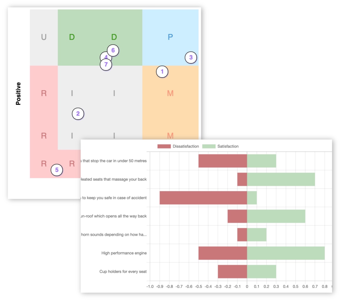
Kano analysis techniques made simple
Source: medium.com
You've run a Kano survey and you've got all the responses from your participants. But now what - how to analyse Kano results?
Below you'll find detail of three types of Kano analysis - how the different approaches actually work, how to apply them, why they're different, pros and cons etc. And a bunch of other useful info!
- Kano evaluation table
- Categorisation analysis (simple)
- Continuous scale (advanced)
- Satisfaction coefficients (advanced)
- Kano analysis examples / case studies
- How to prioritize features
This article is quite technical, but hopefully simple enough that you can understand how you can apply the different techniques to interpret what your results tell you about customer satisfaction.
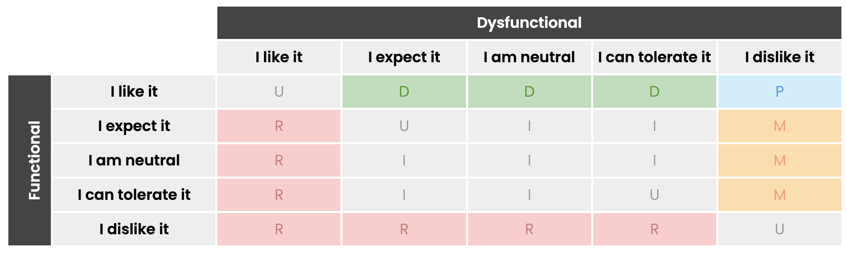
Kano analysis evaluation table
First a quick recap of the Kano evaluation table. In the survey you ask pairs of questions, and then the category indicated by that answer is determined according to the rules of Kano, as per the table:
Kano model categories tool - try this interactive tool to see how the answers affect the category.
Method #1: Categorisation Kano analysis (simple)
This approach is the simplest to understand and apply. This is the standard technique that is taught in the basic Kano model.
In a nutshell, every response to a feature is categorised according to the rules of Kano, and then we look for the most common category across all the responses (ie. the modal average). That becomes the primary category for that feature.
Here's an example.
Feature: "heated seats in a car"
Responses:
| # | Positive | Negative | Category |
|---|---|---|---|
| 1 | I like it | I expect it | Delighter |
| 2 | I am neutral | I am neutral | Indifferent |
| 3 | I dislike it | I can tolerate it | Reverse |
| 4 | I like it | I am neutral | Delighter |
| 5 | I dislike it | I like it | Reverse |
| 6 | I like it | I can tolerate it | Delighter |
Think of each response like a vote for a particular category. And if we count up these different votes...
| Category | Count |
|---|---|
| Delighter | 3 |
| Indifferent | 1 |
| Reverse | 2 |
Delighter has the most votes, so the overall feature is categorised as a Delighter!
This type of Kano model analysis is simple, easy to understand, easy to compute by hand (or with a Kano analysis template if you prefer), and gives nice clear answers.
However it has a couple of drawbacks.
The winner could be marginal - In our example above, 50% of the votes were for Delighter. This seems like a reasonable number. But, Delighter only got 1 more vote than Reverse overall so it's not a clear winner by a long distance.
Other strong opinions are obscured - In the example there are 2 people that feel very strongly against the feature (Reverse), but their opinions would be invisible after the categorisation has taken place.
Final categories are a narrow view - All the information that's represented by the other votes doesn't contribute to the overall category because it's just based on a simple count. You lose any possible nuance.
We try to solve the first two problems through two innovations in our Kano survey software:
Statistically significant winners - We don't just count the votes in the responses, we look for a winner that is clearly in front of the pack, by using empirical rules of normal distribution. This avoids marginal winners.
Radar charts - We show the distribution of responses between the different categories in a visual way. This is quicker to understand at a glance than a table of numbers, and can tell you very quickly if there are any other strong responses in the data.
We solve the third problem by offering a third type of Kano model analysis - a continuous scale which utilises all the different responses to produce a more representative view of customer satisfaction. See method 3.
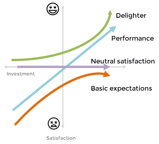
Method #2: Continuous scale (advanced)
Whereas the first method is a modal average, this is more like a mean average (this is the type average that's used most frequenty and what you're probably familiar with).
This approach, developed by researcher Bill DuMouchel, uses all the responses to contribute to the final category so all the nuance is included, and the difference in strength of expression between similar responses can be brought out.
Each response is first converted onto a numerical scale, with more weight attached to positive end of the scale.
| Dislike | Tolerate | Neutral | Expect | Like | |
|---|---|---|---|---|---|
| Feature is present | -2 | -1 | 0 | 2 | 4 |
| Feature is absent | 4 | 2 | 0 | -1 | -2 |
These scales are designed to correlate with potential satisfaction if the feature were included. So "Disliking" the absence of the feature suggests the participant would be satisfied if it did exist.
Next, all functional and dysfunctional responses are averaged together which results in a pair of numbers (one for functional, one for dysfunctional). This pair represents the aggregate total of all the different opinons of the participants.
The pairs for all features are plotted onto a grid, with the different areas of the grid mapped out to Kano categories.
It's possible to use the grid definitions to just declare a single category for each feature but again that would obscure some of the nuance that is plain to see when you plot onto the grid.
To return to our previous example, the scores would look like this:
| # | Positive | Negative |
|---|---|---|
| 1 | I like it = 4 | I expect it = -1 |
| 2 | I am neutral = 0 | I am neutral = 0 |
| 3 | I dislike it = -2 | I can tolerate it = 2 |
| 4 | I like it = 4 | I am neutral = 0 |
| 5 | I dislike it = -2 | I like it = -2 |
| 6 | I like it = 4 | I can tolerate it = 2 |
| Averages | 1.33 | 0.17 |
And if we pop that onto the grid, we get:
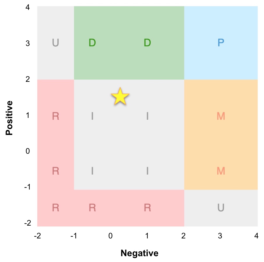
In this Kano analysis example you can see that due to the strength of the Reverse responses the overall average was evenly balanced between Delighter and Reverse, leading to an Indifferent.
This is representative of the total audience opinion, rather than just the 'loudest' segment who voted Delighter.
There are definitely some people who would be delighted, but there are also some who would be upset.
In this way the continuous analysis makes sure you're not ignoring anyone who didn't vote with the crowd, and you know that if you get a clear single category outcome you have a very strong signal from the majority of your participants!
Method #3: Satisfaction coefficients (advanced)
The last type of analysis is a way of getting an overall estimate of how customer satisfaction would change on an absolute scale, if the feature were present or not.
This is helpful if you have many features that end up within a single category, to rank them in order of either minimising negative impact of not having the feature, or maximising positive impact of having it.
The coefficients are calculated by adding up the counts of the main Kano categories (Delighter, Performance, Must have and Indifferent) and using that as the total count.
Then we look at what proportion of that total is likely to be either happy or sad:
For the "better" coefficient (to assess customer satisfaction potential if the feature were present), we see what proportion of the total voted for either Delighter or Performance. These are the categories where people will feel some level of happiness that the feature is present and well executed.
For the "worse" coefficient (to assess customer satisfaction impact if the feature were absent), we look at the proportion of people who voted for either Performance or Must have. Anyone in these categories will be disappointed to some extent if the feature wasn't there or is not good quality.
So, for each feature we would do this:
total = (delighters + performance + must_have + indifferent)
better = (delighters + performance) / total
worse = ((performance + must_have) / total) * -1
The "worse" coefficient is always expressed as a negative number. When you draw it on a graph it looks like this:
This is a great way of seeing how much people's feeling will change. It quantifies the strength of the categorisation so you can prioritise the most impactful features first.
Kano model analysis examples
Example #1: Food recipe website
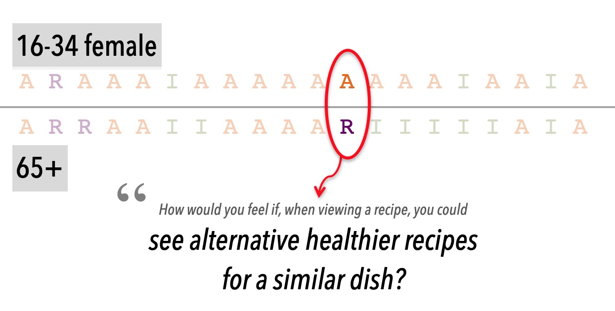
A real-world Kano model example comes from a redesign and replatforming project for a large recipe website. The site had thousands of pages, high traffic and a fiercely loyal audience so changing the product carried real risk. The team needed to modernise the technology and improve the mobile experience, but didn't want to blindly rebuild every old feature.
We used a Kano survey to understand which features users genuinely valued. The survey tested both existing and potential features including:
- Saving recipes
- Technique videos
- Recipe notes
- Healthier ingredient alternatives
- Ratings
- Reminders
- Achievement badges
Responses showed which features were Must-haves, Delighters, Indifferent, or potentially Reverse, and demographic segmentation revealed important differences between user groups.
The results shaped the roadmap. Must-have features, such as saving recipes, were protected. Some unused or low-value features were retired. A few Delighters, such as recipe pitfalls and cupboard-based recipe filtering, were added. The project became faster, less risky, and more valuable because the team focused only on the features most likely to improve customer satisfaction.
Read the full Kano model example →
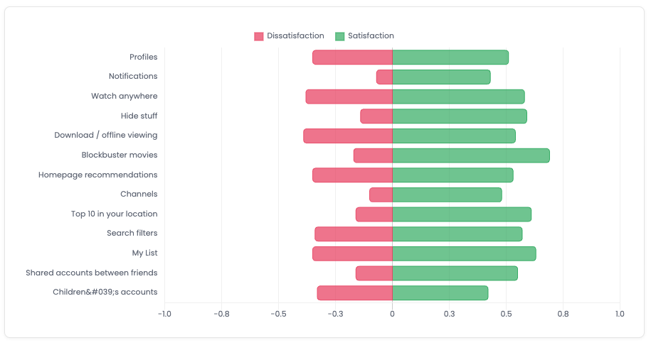
Example #2: Netflix

Another Kano analysis example comes from analysing Netflix's product strategy during a period of subscriber losses, price rises, stronger competition, and controversy around password sharing. The goal was to understand where Netflix might go in future.
The survey tested existing and potential Netflix features, including:
- Profiles
- Offline downloads
- Watch-anywhere access
- Recommendations
- Shared accounts
- Child accounts
- Curated channels
The results showed that offline viewing, watch-anywhere access, My List, recommendations, and profiles were important features to keep, while blockbuster movies, hiding unwanted content, and better search filters had strong potential to improve satisfaction.
The analysis also highlighted some strategic trade-offs. Users wanted better content and better ways to find it, but features that reveal the limits of the catalogue could also increase churn risk. Shared accounts tested as relatively unimportant as a standalone feature, but profiles helped explain why password sharing felt so embedded in the product.
Overall, the case study shows how Kano analysis can turn broad product strategy questions into clearer roadmap decisions. Read the full case study →
Prioritization of features
Obviously once you get some results back from your survey, you'll want to start thinking about prioritisation.
Protect the Must-haves: you need to ensure these features are always included and maintained. Without them, customers won't stick around to enjoy the other features. If they're "big" features, see if you can narrow down (probably with more research or testing) exactly what is the core of the "must-have" part. Maybe there's a thin slice.
Invest in Performance features that support your positioning, and add a few Delighters to create differentiation. This is where you set yourself apart from the competition. Use the coefficient Kano analysis to sequence the features to maximise CSAT.
Cut or delay features that users don't care about (Reverse and Indifferent categories).
It's a practical way to make prioritisation less about internal opinion and more about what will actually improve the product for customers.
Read our article on Kano prioritization →
Summary
Well, hopefully that wasn't too technical and now you have a better understanding of the pros and cons of each type of Kano model analysis.
To sum it up:
Simple categorisation will give you the majority view. Our tool uses statistical significance methods to boost confidence.
Continuous analysis gives you an aggregate view taking into account all the different opinions in the responses.
Satisfaction coefficients give an indication of how much satisfaction could change (up or down) on a linear scale.
Which is better?
Well, we think they're all useful in different ways and worth considering together to give a holistic view of customer satisfaction. For a data-driven look at how these techniques play out across real surveys - including how often results have strong consensus versus weak - see our Kano Survey Design Report, based on analysis of 1,172 real surveys.
All of these analysis types are available on KanoSurveys.com, fully automated and in real-time as your results come in.
Create a free account now
